Dak Lak Province Brand Identity

Inspired by Dak Lak's new development journey after the provincial merger, the GUDJOB team entered the Dak Lak province brand identity design contest with an emblem proposal titled "One shared source, soaring together".

Client

The Dak Lak Provincial Department of Culture, Sports and Tourism

Industry

Scope of work

  • Brand identity design

Result

  • Contest Entry

A desire to excel

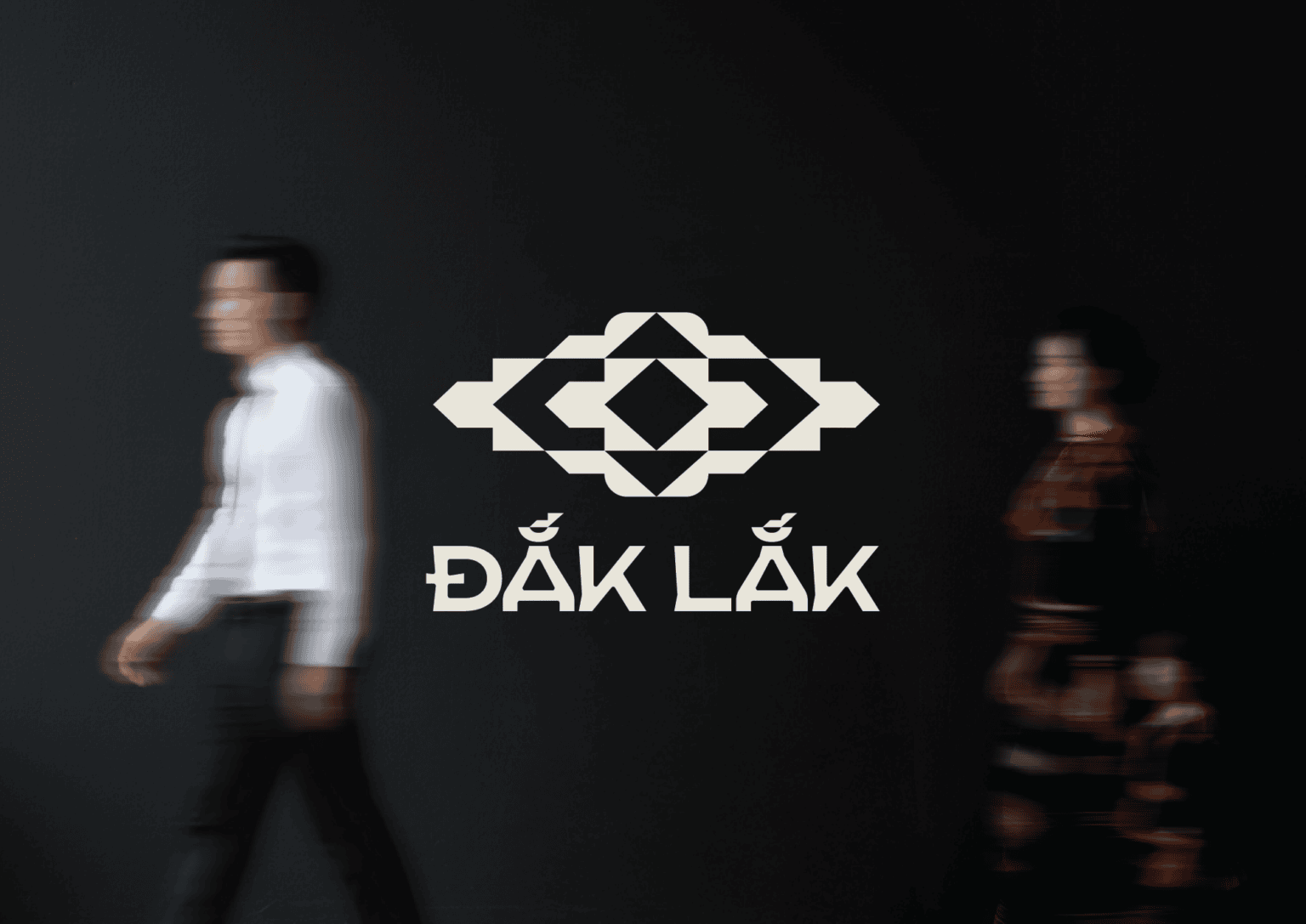
The new Dak Lak emerged from a great convergence. The highlands and the coast are no longer separated at opposite ends of the map, but share a common name, a common heartbeat. Therefore, the symbol is not just an identifying mark, but a "signature" of a new era: soaring – breaking through – integrating, while still preserving the roots of both regions.

Nhan dien thuong hieu Dak Lak Phuong an 1 1 | GUDJOB

The new Dak Lak emerged from a great convergence. The highlands and the coast are no longer separated at opposite ends of the map, but share a common name, a common heartbeat. Therefore, the symbol is not just an identifying mark, but a "signature" of a new era: soaring – breaking through – integrating, while still preserving the roots of both regions.

At the center of the symbol is the point of convergence, where shared origins and cultures return to a new home. The two sides are symmetrical and balanced, like two equal regions supporting each other's progress. From that shared core, directions radiate outwards, suggesting a spirit of integration and multi-dimensional development: sharing the same roots, yet daring to take many paths to grow. Minimalist and modern, the symbol easily blends with everyday life, becoming the hallmark of a new Dak Lak – coming together under one roof to achieve remarkable progress.

Full presentation

Brand identity for Dak Lak province (Option 1)

Sharing the same source, rising together.

“The Ba River flows to Da Rang,
Who cherishes Dak Lak like Phu Yen?”

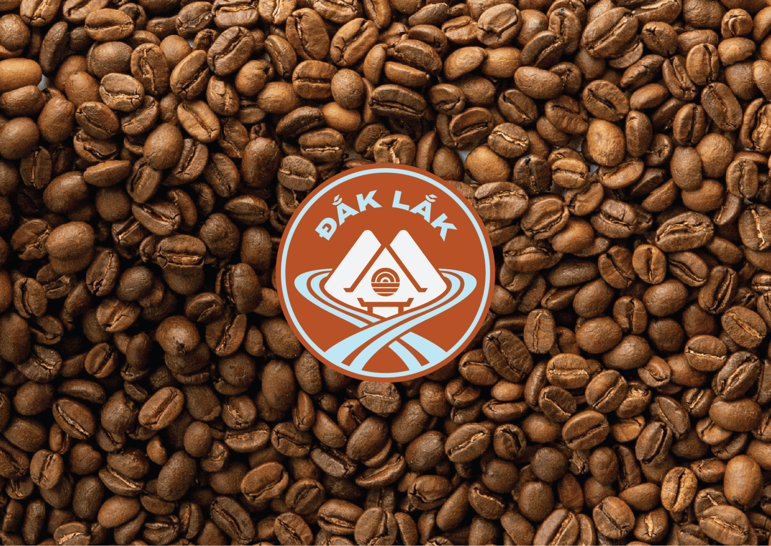
Some bonds run deep for ages, waiting for the day they are finally named. For the new Dak Lak, we didn't want to tell the merger as a simple sum of “mountains” and “sea”. Instead we traced a real bond: the Ba River — a “geographic lifeline” winding from source to mouth, quietly tying Dak Lak and Phu Yen together as siblings.

Nhan dien thuong hieu Dak Lak Phuong an 2 25 | GUDJOB

The new emblem is created from that spirit, like an embrace between two brothers: not just standing side by side, but intertwined. Looking at Dak Lak, we still hear the rhythm of the sea breeze and the open aspirations of Phu Yen. Thinking of Phu Yen, we still recognize the vast plateau and the inherent strength of its red basalt soil. A tight embrace, but not closed; an embrace to grow together, to fly together.

In the symbolic form, the flow is simplified into a gentle, embracing rhythm, like a source nourishing both the upper and lower regions. The central point suggests a cultural "anchor": the meeting point of Nhan Mountain, Ghenh Da Dia (Disk Rock Cliff), and the plateau ranges. Minimalist yet not cold, modern yet soulful, the emblem retains the breath of community: the imprint of the longhouse, the rhythm of sea life, and the strength of the plateau land.

The colors red-orange and blue go together, expressing determination and belief, supporting Dak Lak in advancing agriculture and fisheries, opening up opportunities for industry, services, and logistics, and illuminating tourism as a major gateway for a new Dak Lak to reach further.

Full presentation

Brand identity for Dak Lak province (Option 2)